Cookacco: from idea to a working app, all inside TMM.
Idea · Research · Brand · UX/UI · Logic · Monetisation · Web/PWA
A cooking app for people who watch gout, cholesterol or blood sugar in their food. Research, brand, UX, app logic, monetisation and code — we did all of it ourselves.
Live as a web app (PWA) · mockups shown in a phone frame
Work sample
CookaccoCase study · TMM’s own product · idea, brand, UX/UI, web/PWA and monetisation
Oct 2026first project records
Web · PWAphone, tablet and computer from one codebase
51screens in UI v1.2
69pages of brand manual v1.0
50recipes in the live app
3tiers: one free, two paid
Recipes don’t know what you watch in your food.
01 · Idea
If you have gout, high cholesterol or diabetes, every meal raises the same question: does this suit me? With more than one condition, the advice can even contradict itself.
Why Cookacco · Norbert Čierťašský, founder
“I needed recipes that would also take into account that I have two conditions which mean I have to watch out for quite a lot of foods. At the same time, I didn’t have time to keep thinking about what to cook.”
How might we…
How might a cooking app help someone with gout, cholesterol or diabetes choose dinner — without pretending to be a doctor?
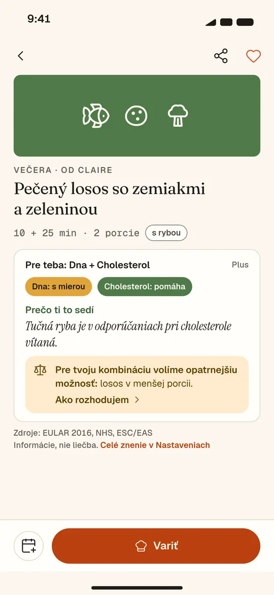
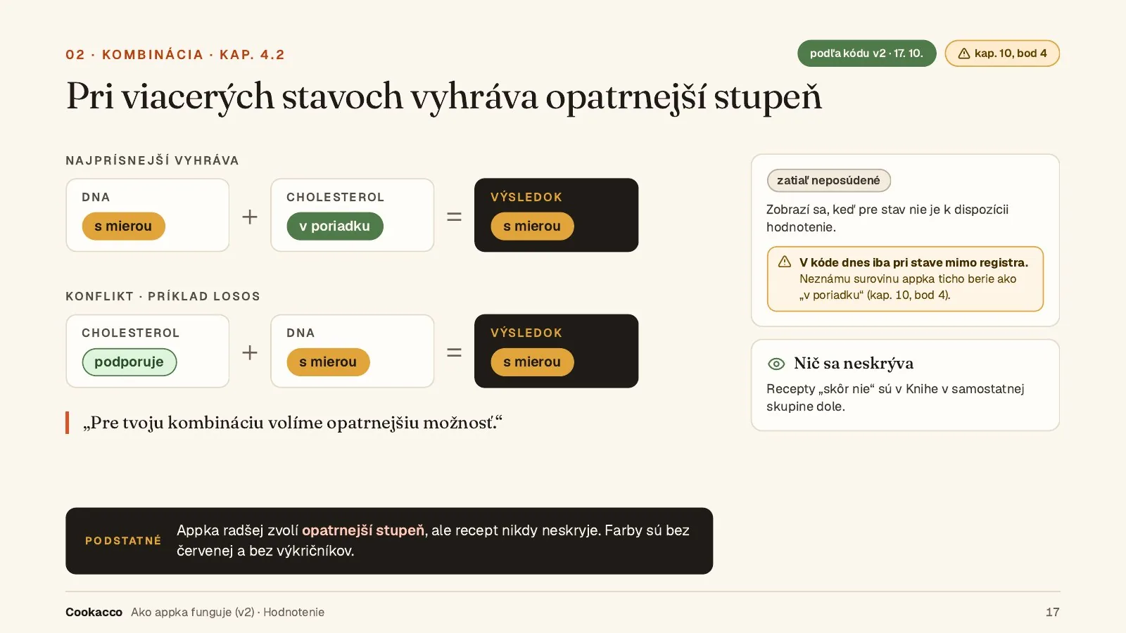
An example of a clash: salmon. For cholesterol, professional bodies recommend it; for gout, it belongs in the “in moderation” group. The app has to say that clearly and without scaring anyone.
Limits from day one: Cookacco is a kitchen diary, not a medical device. It doesn’t diagnose, give doses or risk scores, and it doesn’t replace a doctor.
One rule never moved: the rating of a recipe for the condition you chose is never behind a paywall.
First we found out what exists — and what we’re allowed to claim.
02 · Research
The app market, professional sources for every condition and the licences of nutrient data.
Annual plans anchor the market, and longer trials tend to go with higher conversion. The sources themselves (RevenueCat, Adapty) point out it’s a correlation.
The closest family-focused competitor handles allergies and preferences, not health conditions with sources. We didn’t see combining several conditions offered elsewhere — though we didn’t search for it systematically.
Rating rules rely only on grade-A recommendations from professional bodies, for example EULAR, NHS, ADA and ESC/EAS.
What we chose not to build: a symptom diary, lab results, risk scores or a report for the doctor.
16apps comparedpricing and models, Czech, Slovak and international
12conditions cataloguedeach with sources; histamine dropped for weak evidence
2open nutrient databasesUSDA FoodData Central and CoFID
A brand manual as the single source of truth for design and code.
03 · Brand
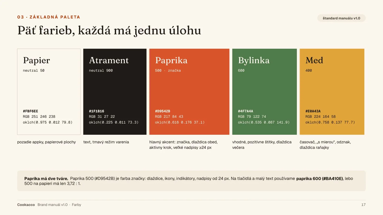
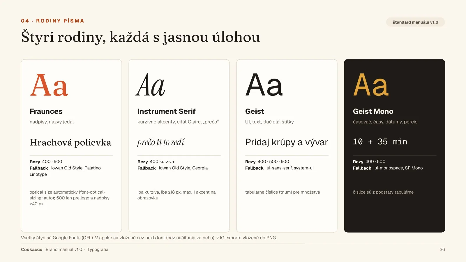
69 pages: logo, five colours with one job each, four type families, ingredient icons, tone of voice, components and Instagram templates.
Design tokens (CSS and JSON) are generated from the manual and imported straight into the code. Colour, type, shadows and motion live in one place.
Health speaks quietly in this brand: no red, no exclamation marks, one short line of “why”.
The tone is friendly and informal. Advice in the app is a tip, never an order or a ban.
The manual also covers dark mode, 10 Instagram templates and a 44-slide final presentation.
Work sample
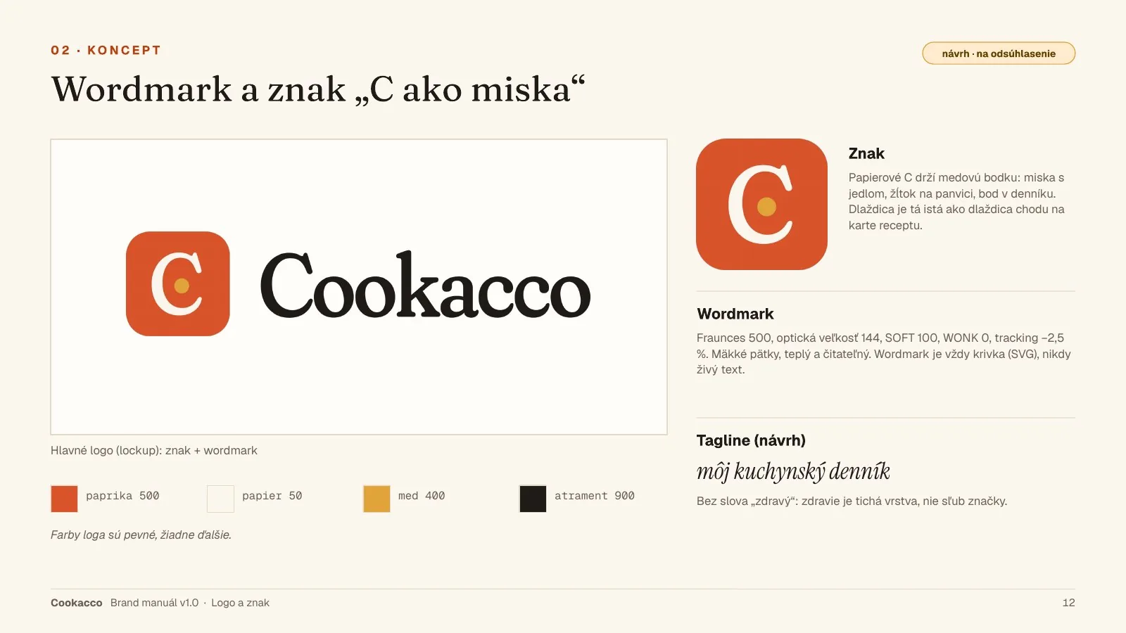
03.1Wordmark and the “C as a bowl” mark
Work sample
03.2Five colours, each with one job
Work sample
03.3Four type families
Work sample
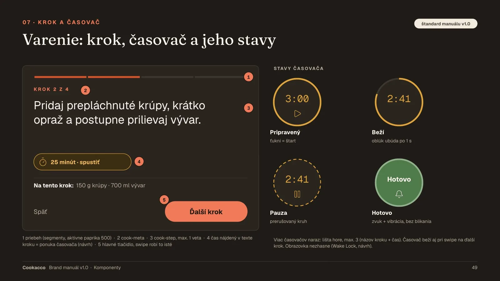
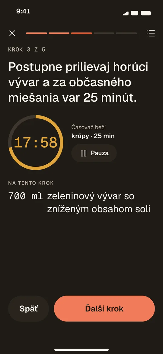
03.4Cooking: step, timer and its states
Food first, health quietly.
04 · UX/UI
UI v1.2 has 51 screens for phone, tablet and desktop. Version 2 added several conditions at once, people at the table and the subscription.
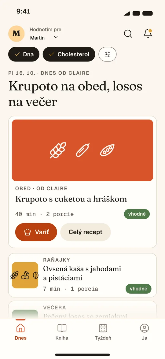
Main flow: Today → Book → Recipe → Cook → Done. The rating is one badge and one line of “why”.
With several conditions, a card shows one badge, set by the strictest condition. “Better not” recipes aren’t hidden, they just move lower.
A soft paywall appears only at the second condition, the first weekly plan or the second person at the table.
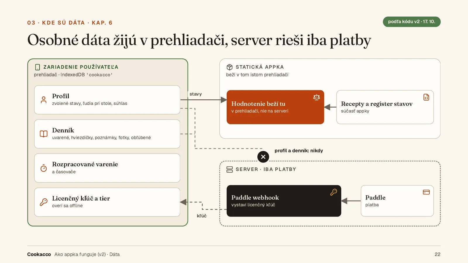
Health data is saved only after explicit consent, and it stays on the device.
Iterations: v1.0 → v1.1 (real recipes and nutrition data) → v1.2 (prices and reminders).
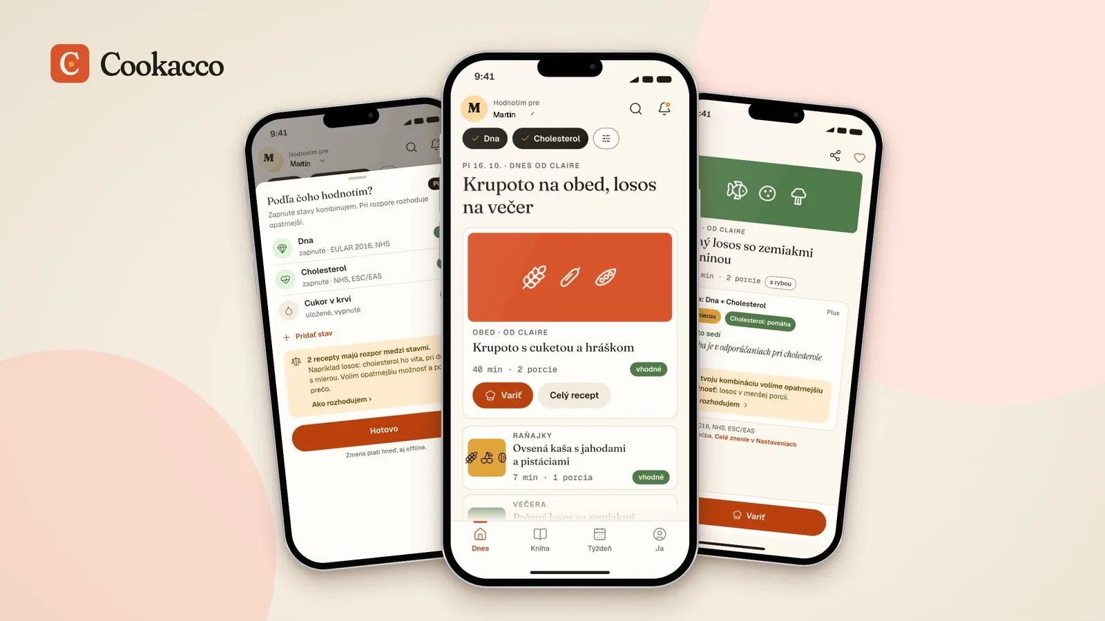
04.1Today
Open the app and see what’s for lunch.
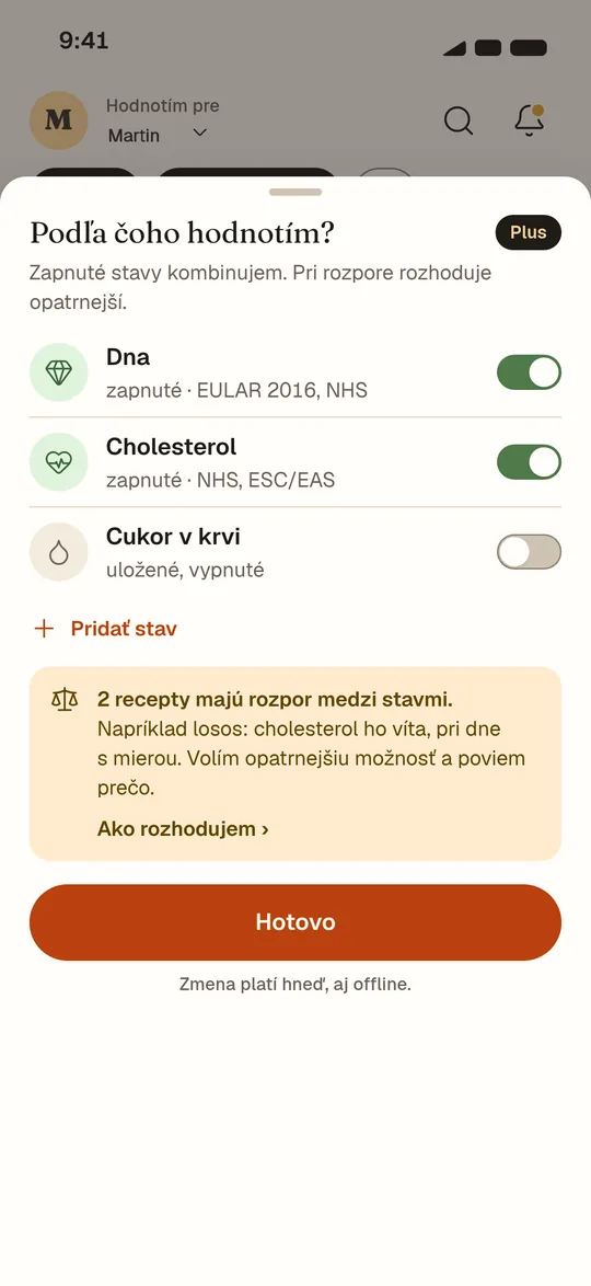
04.2What you watch
Switch conditions on with one tap.
04.3Recipe
The reason sits right at the recipe, with its source.
04.4Cooking
Full-screen steps with a timer.
With several conditions, the more cautious option wins.
05 · Logic
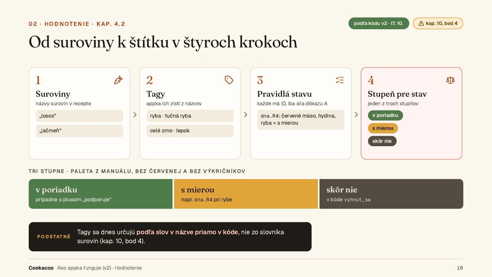
Ingredients → tags → rules with an ID and a source → one of three levels: fine, in moderation, better not.
Every rule has an ID and a source with a review date. The “why” line is 90 characters at most.
The build stops if a line promises a health effect (a word like “detox”) or contains a number with a unit.
For type 1 diabetes, kidney disease and pregnancy the app doesn’t rate recipes. It shows neutral information and recommends seeing a doctor.
In progress: a new condition, fatigue, with two levels (Basic and Level 2).
Work sample
05.1From ingredient to label in four steps
Work sample
05.2The stricter level wins
You pay for convenience, not for safety.
06 · Monetisation
Three tiers. Kitchen is free and rates one condition at a time. Plus and Pri stole add combinations, planning and people at the table.
No plan is pre-selected, and agreeing to renewal is a separate step. The monthly plan has no trial and is paid right away.
Cancelling sits right under the plan: two taps, no chat, no phone call.
Paddle handles payments as merchant of record, including EU VAT. The Paddle sandbox is set up with the products and prices; live payments come after testing.
We had planned an A/B test of a 14- versus 21-day trial, then dropped it and went with 21 days.
FreeKitchen
0 €0 Kč
Recipe book, cooking, rating for one condition at a time

 Work sample
 Work sample
 Work sample
 Work sample
 Work sample
 Work sample
 Work sample
 Work sample